Tools ModelRobustness
Table of Contents | Previous | Next
Model Robustness Tool
You use the Model Robustness tool to measure the sensitivity of a regression model to artifacts in new spectroscopic measurements. To open the Model Robustness tool, on the Analysis window, click Tools > Model Robustness, and then click Shifts, Interferences, or Single Variable Test.
Shifts
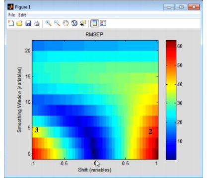
The Shifts option measures the sensitivity of a regression model to shifts in x-axis data that are caused by instrument instability-that is, if you have an instrument that is not particularly stable or reproducible over time, what is the impact on predictions using the given model? The Shifts plot is a three-dimensional plot that details the RMSEP (Root Mean Squared Error of Prediction) for the model as a function of shift, where shift is described in terms of the number of variables and the Smoothing window.
- Example of a Shifts plot
Consider the figure above, which shows the model robustness for a regression model with an RMSEC (Root Mean Squared Error of Calibration) of approximately 0.5. As shown in this figure:
|
|
|
Interferences
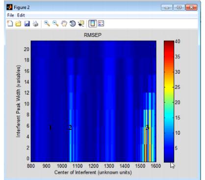
The Interferences option measures the sensitivity of a regression model to the location and width of a new peak in test data-that is, if you have a chemical entity that is present in the test data but that was not reflected in the calibration data, what is the impact on predictions using the given model? The Interferences plot is a three-dimensional plot that details the RMSEP (Root Mean Squared Error of Prediction) for the model as a function of a new peak, where the peak is described in terms of its width and location.
- Example of an Interferences plot
Consider the figure above, which shows the model robustness for a regression model with an RMSEC (Root Mean Squared Error of Calibration) of approximately 0.5. As shown in this figure, the RMSEP for the model can be impacted in one of three ways:
|
|
|
Single Variable Test
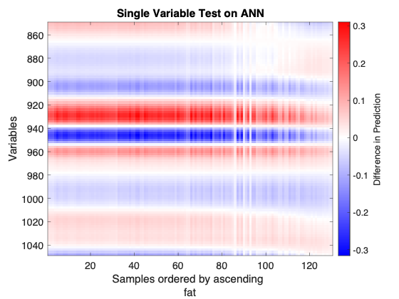
The Single Variable Test observes the sensitivity of each variable once samples are perturbed and applied to the model. For each variable at a time, the standard deviation of that variable divided by 100 is added to all samples in the dataset. This perturbed dataset and the original dataset are applied to the model, and the differences between each sample's predictions are monitored. The result is an image showing the model sensitivity as a function of the variables and the predicted values.
- Example of an Single Variable Test plot
Consider the above figure. A neural network was calibrated on NIR spectra of meat samples to predict the "fat" content of those samples. The figure shows the sensitivity of the prediction ("fat" content) to small changes to the calibration samples, one variable at a time. It highlights the spectral regions where the predicion is more sensitive to these single-variable changes. This is a linear perturbation analysis since the changes to the calibration samples are very small relative to the sample values. The calibration samples (x-axis) are ordered by their associated "fat" content values so the left side of the plot corresponds to low "fat" values while the right side corresponds to high "fat" values. The y-axis shows spectral wavelength (nm).
The figure shows blue and red "bands", spectral regions where the response is negative or positive, are mostly constant horizontally showing that the perturbed response does not depend on the samples' fat content for the first 90 samples (90 calibration samples with lowest fat content). However, the perturbed response weakens for samples with higher fat content over all wavelengths and actually reverses sign for wavelengths smaller than 900 nm or longer than 1040 nm.
The test suggests the spectral ranges which have the strongest and consistent perturbation response across the figure might be the more important variables for this model, for example 970 to 890 nm. The results may be more useful to a user with knowledge of the dataset's origin.


