Effects Plot: Difference between revisions
Jump to navigation
Jump to search
imported>Donal No edit summary |
imported>Donal No edit summary |
||
| Line 11: | Line 11: | ||
===Interpretation=== | ===Interpretation=== | ||
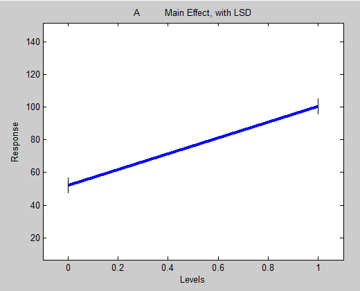
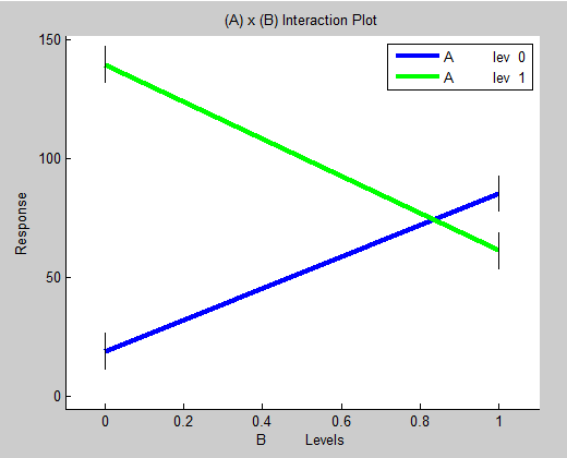
Main Effects plots show how the mean response of a factor varies over its level. The levels of this factor are marked on the x-axis. Data points are plotted with y-value giving the mean for the factor at that factor level. | |||
[[Image:Maineffectplot_fA.png]] | |||
[[Image: | and | ||
[[Image:Maineffectplot_fAxB.png]] | |||
Revision as of 14:58, 9 November 2011
The following describes the Effects Plot for analyzing Design of Experiments results with MLR.
Effects Plot
Usage
Effects plots are used to identify which experiment factors are important, including interactions. Clicking on the 'DOE Effects Plot' menu button will open a window where you select which main effect or interaction effect you wish to view. Selecting an effect and clicking 'OK' opens the Effects Plot.
Interpretation
Main Effects plots show how the mean response of a factor varies over its level. The levels of this factor are marked on the x-axis. Data points are plotted with y-value giving the mean for the factor at that factor level.

and
