Compress gaps
Compress X-axis Gaps
When variables or samples are excluded in a DataSet, the remaining data is usually plotted with gaps set to represent the excluded data. In this way the relationship between the included data and whatever x-axis scale they are plotted against is maintained. For example, if the data is plotted against an axis scale, the entire axis scale is shown (except excluded end points) with empty spaces where data is excluded.
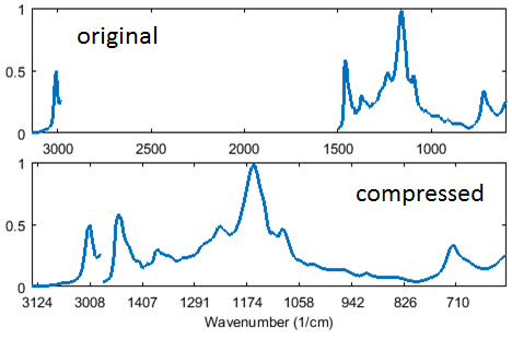
In some cases, this leads to large empty regions of a plot and makes it difficult to interpret the plot. The "Compress x-axis gaps" option (accessible through the toolbar button ![]() on a Plot Controlled figure) will remove these gaps and show the data with the excluded data trimmed out, but maintaining an appropriate axis scale.) See the example plot below which shows a Near-IR spectrum with a large section of excluded data in the middle of the plot both without and with the compression option.
on a Plot Controlled figure) will remove these gaps and show the data with the excluded data trimmed out, but maintaining an appropriate axis scale.) See the example plot below which shows a Near-IR spectrum with a large section of excluded data in the middle of the plot both without and with the compression option.
Note that zooming in on a plot when this option is enabled will not increase the axis ticks and number of labels as it does with a traditional plot.
