Half-Normal Probability Plot: Difference between revisions
imported>Donal No edit summary |
imported>Randy |
||
| (4 intermediate revisions by 2 users not shown) | |||
| Line 5: | Line 5: | ||
===Usage=== | ===Usage=== | ||
Half-Normal plots | The Half-Normal plots is a graphical tool used to help identify which experiment factors have significant effects on the response. Clicking on the 'Half-Norm' menu button will open a Half-Normal probability plot. | ||
[[Image:Halfnormalploticon.png]] | [[Image:Halfnormalploticon.png]] | ||
| Line 11: | Line 11: | ||
===Interpretation=== | ===Interpretation=== | ||
This plot shows the magnitude of the experiment's effects as “Standardized Effects”, ordered in increasing magnitude, along the x-axis. The Standardized Effect for a factor is the difference of the average response variable over "high" factor levels minus the average response over the "low" factor levels. The y-values are not based on the DOE data. They are given by the idealized expected values for this number of effects, ranked by increasing value, if they were drawn from a half-normal distribution. Thus, the y-value for the jth effect is the half-normal probability value for the jth value (rank) in a variable with N observations. A half-normal distribution is the distribution of the abs(X) with X having a normal distribution with mean zero. | This plot shows the magnitude of the experiment's effects as “Standardized Effects”, ordered in increasing magnitude, along the x-axis. The Standardized Effect for a factor is the difference of the average response variable over "high" factor levels minus the average response over the "low" factor levels. The y-values are not based on the DOE data. They are given by the idealized expected values for this number of effects, ranked by increasing value, if they were drawn from a half-normal distribution. Thus, the y-value for the jth effect is the half-normal probability value for the jth value (rank) in a variable with N observations. A half-normal distribution is the distribution of the abs(X) with X having a normal distribution with mean zero. The absolute value of a factor's effect is the value plotted on the x-axis, but the color of the data points indicates whether the original effect is positive (red) or negative (blue). | ||
[[Image:Halfnormplot.png]] | [[Image:Halfnormplot.png]] | ||
The | The points comprising factors with small and/or insignificant effects on the response will describe (roughly) a straight line on the plot. The points for factors with a 'large' and significant effects will visually fall off of the straight line described by the insignificant factors. A red line through the insignificant factors helps to graphically delineate the difference between significant and insignificant factors. So selecting the factor points which lie reasonably off of the line describing insignificant factors is an easy graphical way to identify important factors and start the process of optimizing the model. Consult the ANOVA table and MLR model diagnostics in conjunction with the use of the Half-Normal Probability plot for the final selection of significant factors for the model. Also note that the Half-Normal Probability plot is used for factorial experiments only. | ||
Note that the y-values are half-normal "z" values in the range (0, inf) but the axis is labeled using the corresponding half-normal cumulative distribution function values for convenience. | |||
===Further information=== | ===Further information=== | ||
Latest revision as of 12:10, 14 November 2011
The following describes the Half-Normal Probability plot for analyzing Design of Experiments results with MLR.
Half-Normal Probability Plot
Usage
The Half-Normal plots is a graphical tool used to help identify which experiment factors have significant effects on the response. Clicking on the 'Half-Norm' menu button will open a Half-Normal probability plot.
Interpretation
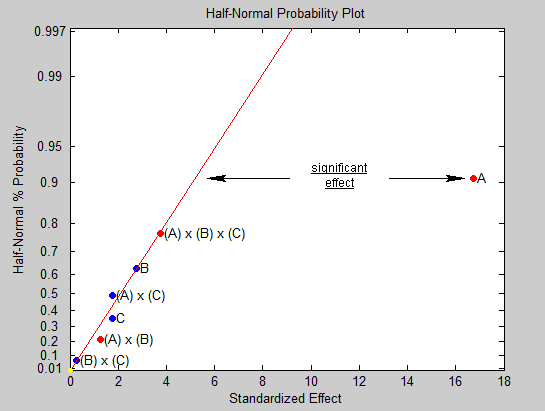
This plot shows the magnitude of the experiment's effects as “Standardized Effects”, ordered in increasing magnitude, along the x-axis. The Standardized Effect for a factor is the difference of the average response variable over "high" factor levels minus the average response over the "low" factor levels. The y-values are not based on the DOE data. They are given by the idealized expected values for this number of effects, ranked by increasing value, if they were drawn from a half-normal distribution. Thus, the y-value for the jth effect is the half-normal probability value for the jth value (rank) in a variable with N observations. A half-normal distribution is the distribution of the abs(X) with X having a normal distribution with mean zero. The absolute value of a factor's effect is the value plotted on the x-axis, but the color of the data points indicates whether the original effect is positive (red) or negative (blue).
The points comprising factors with small and/or insignificant effects on the response will describe (roughly) a straight line on the plot. The points for factors with a 'large' and significant effects will visually fall off of the straight line described by the insignificant factors. A red line through the insignificant factors helps to graphically delineate the difference between significant and insignificant factors. So selecting the factor points which lie reasonably off of the line describing insignificant factors is an easy graphical way to identify important factors and start the process of optimizing the model. Consult the ANOVA table and MLR model diagnostics in conjunction with the use of the Half-Normal Probability plot for the final selection of significant factors for the model. Also note that the Half-Normal Probability plot is used for factorial experiments only.
Note that the y-values are half-normal "z" values in the range (0, inf) but the axis is labeled using the corresponding half-normal cumulative distribution function values for convenience.
Further information
For more information on Half-normal Probability plots see:
http://www.itl.nist.gov/div898/handbook/pri/section5/pri598.htm
