Applying a Model Quick Start
|
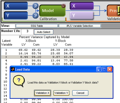
Congratulations! You have collected calibration data and gone through the exercise of building a model that meets your objectives. Now, you want to exert one of the most stringent tests - applying your model to new data. If you have just completed the model building process, all that needs to be done is to load some new data as validation data. Another scenario is that you have a model that has been built awhile ago, and you wish to apply it to some new data.
In this example (using the included demonstration dataset "nir_data") , there are three variables in the workspace
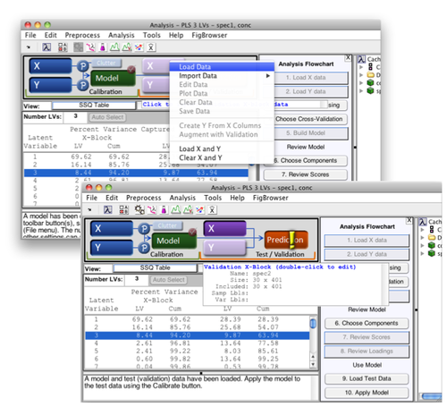
The concentration data contains values for five separate components. The model mymodel predicts only one of these concentration values. First, click on the icon for mymodel in the Workspace browser and drag it into the Analysis GUI (or double-click it to open a new Analysis GUI). You will see the SSQ table populated with values, indicating that the model has been loaded. If the model cache was activated during the course of building the model and remains so, the calibration data will also be loaded. You can see this by noting that the X and Y buttons appear depressed, and when you pass the mouse cursor over either information on the respective data blocks is revealed.
| |
|
Now that the model has been loaded
| |
|
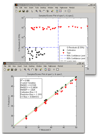
When you click on the "Review Scores" button, a multiplot figure will open. Try double-clicking on each subplot to create separate figures. One useful plot is Q residuals versus Hotelling's T2, with both the validation and calibration data visible. In the Plot Controls window, select "Hotelling T^2" for the x-axis, and "Q Residuals" for the y-axis. Make sure that the "Show Cal Data with Test" box is checked toward the bottom of the Plot Controls window. Finally, select "View" under the Plot Controls menu, then "Classes", followed by "Cal/Test Samples"; this will apply color/symbol coding for the two classes of samples. It is sometimes useful to use log scales for Q residuals and/or T2; in this example, a log scale is used for the Q residuals. For the second plot, "Y Predicted" is selected for the y-axis along with "Y Measured" for the x-axis. As in the Q residuals vs. T2 plot, the black circles represent the calibration samples and the red triangles denote the validation samples. We note from these two plots that:
| |


